OmaSeure app is used by Seure’s employees to find and reserve work shifts. Based on user feedback and research the app was in need of a redesign and new features. The design was done in Figma, using styles and components to speed up the process for the redesign and also to help communication with the team.
Although our statistics show that the app is most often used in fairly large mobile devices, the design was done in a small frame size (360x640px). Using a small frame size makes it easier to ensure that the app looks coherent in all devices, from small to large.
The work started with a visual redesign. The main problem with the style was that bright colours on black background wasn’t easy on the eye, and it made it difficult to distinguish element hierarchy. The app needed a more modern look, which would also make it easier to navigate through tasks and complete them.
The work started with creating all the flows and frames in Figma. That made it easier to define and implement a new scale of colours. The colour styles were designed to have an intended use. For example, turquoise was defined as the main call to action colour, used only in interactive elements such as buttons, links and toggles. A scale of grey shades was defined for non-interactive elements, such as background, cards and lists. Using a more purposeful scale of colours refined the element hierarchy and made it easier to guide user focus.
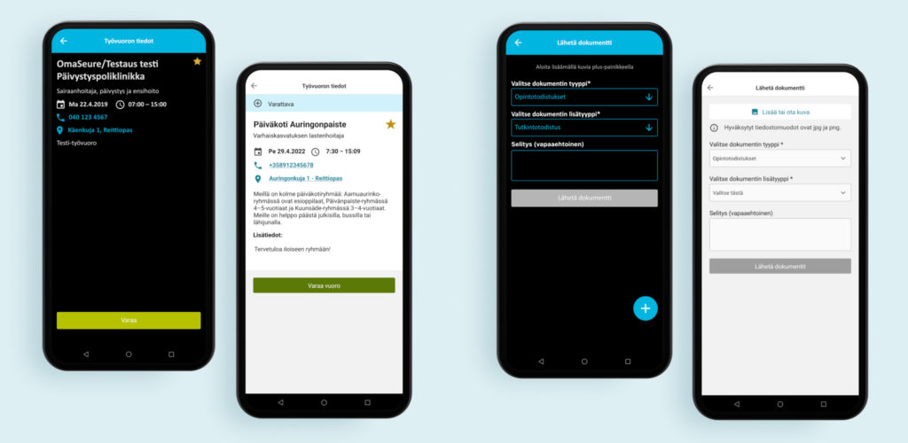
One important aspect of the redesign was to improve visual accessibility.
- Text and background pass AA accessibility standard of colour contrast ratio over 4.5:1. This could be easily tested using Figma plug-ins
- Icons were added so that information wasn’t visible just with colour. For example, an error message was in red, so an error icon was added to accompany it
- Links had a different colour from other text and underlining was added
- Most of the text was switched to 16px which is WCAG2.1 AA recommendation
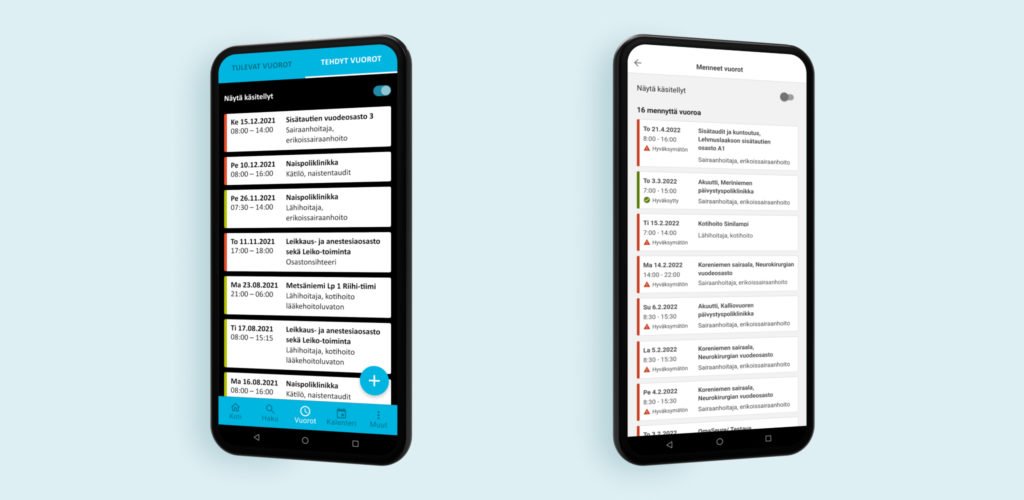
In the redesign, it was also taken into account
that Seure had updated their brand. New brand
elements were also added to the app, for example
a new brand photo to the splash screen and
illustrations in empty states.
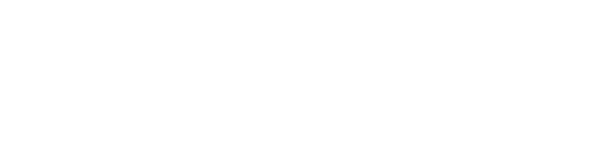
After the visual redesign was designed, it was time to focus on a navigation update. The app used plus buttons in many task flows, from which tapping revealed additional functions. The buttons were floating on top of other interactive elements, causing a high risk for mistapping. The plus buttons were replaced with a list-type approach, where the functions were visible from the start and labelled clearly. The benefit of the list approach was to reduce the user’s memory load.
The bottom navigation needed to be thought out more carefully and a new feature, messaging needed to be added. Since the recommendation for app navigation is to have less than five tabs, there was a need for prioritizing.
A user study revealed that the Calendar tab was rarely used, so it was fused with the Shifts tab to make room for the Messages tab. The list approach made it easy to add more functions to the same tab page, without making it look confusing and crowded.
While doing the navigation update, smaller changes were also done
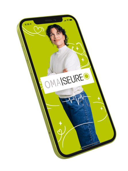
- The front page was mostly empty. The space was utilized better by adding news and quick links to the most common actions there
- The user study showed that search filters weren’t used that often. They used to be available from a button floating on top of the cards. This was changed so that the filters were visible directly under the Search-tab banner. The filters can be toggled to hide them if the user feels they take up too much space.
- A new feature was that users were able to edit their own information, such as contact information
Major changes were done to the app which hopefully improved the whole experience for the users. The redesign also future-proofed the app, so that in the future it’s easier to add new changes, such as features or styles.
All the changes are now live and we eagerly follow analytics and wait for user feedback to know what to improve next.

