- Blog
#Design #ROI #User research #UX
Invest in UX for a better ROI
- 05/06/2024
Reading time 4 minutes
More and more companies are investing in design systems. Design systems help to create a single source of truth for teams to design, develop and realize digital solutions. They are not just style guides, component/pattern libraries, or brand manuals. They are all that.
Personally, I find Design systems super interesting. Even if not actually building one, there are a lot of good concepts and ideas that can be utilized in projects, where we build digital solutions.
In the beginning, there was Figma
We use Figma as our primary design tool in all of our projects. I usually start with a basic template and common definitions, like Text styles, color styles, a basic 8pt layout grid, and work from there towards the details. The basic setup can look something like this:
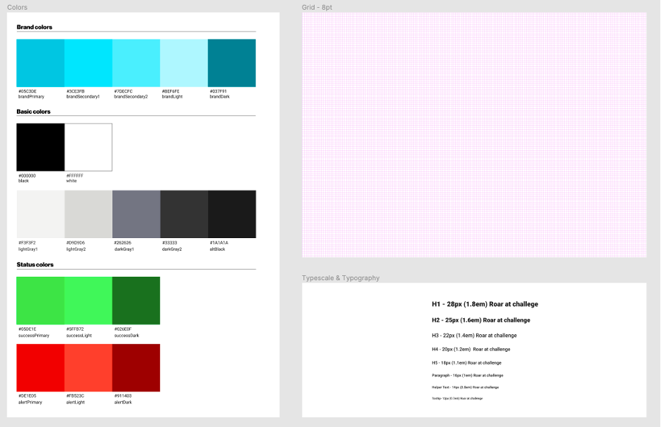
Where this is nice to have. Figma is a fun tool to work with and Sharing designs is quite easy. Still, a Figma link leaves room for interpretation. It is one thing to have a link where there is information about colors, typography, etc. but it much better to get the actual information as data.
Design tokens are starting to gain popularity, especially in the design systems community. Tokens are nice, bite-sized “assets”, to communicate design decisions for development. They are kind of like SCSS variables and mixins. But as they are generic, you are not tied down to any framework or language. You can use them almost anywhere.
In practice, tokens are design values, stored in JSON files and used in code. A file showing color definitions could look something like this:
{
    "tokens": {
        "color": {
            "brandPrimary": {
                "type": "SOLID",
                "value": "#05c3de"
            },
            "brandSecondary1": {
                "type": "SOLID",
                "value": "#3ce3fb"
            },
            "brandSecondary2": {
                "type": "SOLID",
                "value": "#7decfc"
            },
            "brandLight": {
                "type": "SOLID",
                "value": "#bef6fe"
            },
            "brandDark": {
                "type": "SOLID",
                "value": "#037f91"
            },
One could write the JSON by hand, but that can become time-consuming. I have been testing different Figma plugins available to extract the style information. So far have gotten closest to what I need with a plugin called design tokenizer. Would be really interesting to try and write a plugin for my own needs, but for now, I think I will manage with this.
Here at Zure for we use Material UI in many of our projects. One place where tokens could come real handy is in setting up the application’s theme. A theme is used to specify common styling definitions and help in giving a consistent tone for the solution.
If we use color values as the example, below shows a snippet of how we can set up our theme colors based on the design tokens defined earlier:
import { createMuiTheme } from '@material-ui/core/styles';
import tokenData from '../Tokens/tokens.json';

const { tokens } = tokenData;

//Colors
//Brand Colors
export const brandPrimary = tokens.color.brandPrimary.value;
export const brandSecondary1 = tokens.color.brandSecondary1.value;
export const brandSecondary2 = tokens.color.brandSecondary2.value;
export const brandLight = tokens.color.brandLight.value;
export const brandDark = tokens.color.brandDark.value;

export const defaultTheme = {
    name: 'Default Theme',
    palette: {
        primary: {
            light: brandLight,
            main: brandPrimary,
            dark: brandDark,
            contrastText: white,
        },
       },
};
In practice, we take the value definitions of each color from our token file. Use them to define the colors available in the project, and then use them in our palette definition.
You might notice the same naming being repeated in Figma, in the JSON, and within the theme. A consistent naming convention helps a lot with managing the content and it is a good practice to agree upon one when starting a new project.
Now that we have our design template in place, our basic tokens defined and our theme setup, it is time to start thinking components. This is where storybook comes in handy.
Storybook is a tool for UI development. It makes it possible to develop and test UI components and features in a fast and isolated way, without considering the whole project and without compromising the business logic.
A storybook story captures the rendered state of a UI component. Stories are written in Component Story Format (CSF)–an ES6 modules-based standard–for writing component examples and you can easily spot them as the files that end with .stories.js or .stories.ts.
Figma is really good for prototyping ideas, but storybook makes it possible to move faster from prototypes to actual code. Storybook helps in isolating parts of the solution for validation and testing. I think it is a really cool UI workshop and playground environment. It helps in design validation. Also keeping the code as the primary source of truth for the solution and also forces us who design to come out from our trenches. Even as a designer, if you don’t code it is still valuable as it helps the developer to show something fast and your team to gather feedback on the solution level faster.
Not too long ago Storybook was updated to support MDX. this makes it possible to write JSX inside the story related markdown documents. This combined with their docs addon makes it possible to generate and maintain versatile and rich project documentation directly within the solution. You can easily spot the storybook related mdx files in the project as the files that end with .stories.mdx.
With Iconography, typography, and Color palette definitions available out of the box it is now super easy to have the same color and typography views both in Figma and in the project:
Color palette:
<ColorPalette>
    <ColorItem
        title="primary brand colors"
        subtitle="brandPrimary, brandSecondary1, brandSecondary2, brandLight, brandDark"
        colors={[brandPrimary, brandSecondary1, brandSecondary2, brandLight, brandDark]}
    />
</ColorPalette>

Typography:
<Typeset fontFamily={[fontFamily]} fontSizes={['28px']} fontWeight={['bold']} sampleText="H1 - Roar at challenge" />
<Typeset fontSizes={['25px']} fontWeight={['bold']} sampleText="H2 - Roar at challenge" />
<Typeset fontSizes={['22px']} fontWeight={['normal']} sampleText="H3 - Roar at challenge" />
<Typeset fontSizes={['20px']} fontWeight={['normal']} sampleText="H4 - Roar at challenge" />
<Typeset fontSizes={['18px']} fontWeight={['lighter']} sampleText="H5 - Roar at challenge" />
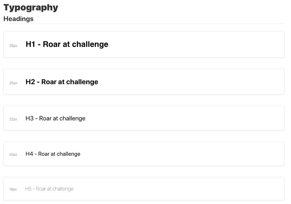
Now that we have our styles documented, we can start documenting our components and stories.
We have a button as our example component and again we start from Figma, where we design our different buttons and states related to them:
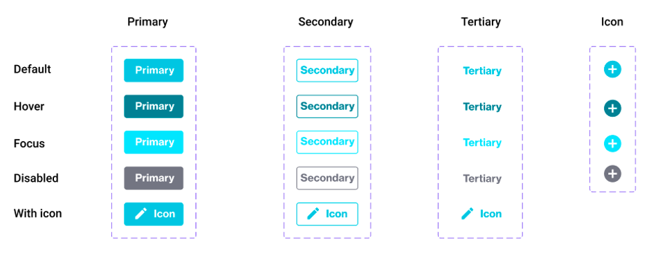
Based on the design we can build our different components and stories to display them. Below is a simple example of a story, that describes a button:
import React from 'react';
import { text, boolean, } from '@storybook/addon-knobs';
import { action } from '@storybook/addon-actions';

import { ButtonPrimary } from './buttonPrimary';

export const PrimaryButton = (props) => (
    <ButtonPrimary
        disabled={boolean('Disabled', false)}
        caption={text('Label', 'Primary')}
        onClick={action('button clicked')}
    />
);
It is quite common to write multiple stories per component that describe all the “interesting” states a component can support. But with a handy Storybook addon, called knobs we can narrow down the number of stories. It gives us switches to give interactive options, test different states, styles and play with component attributes. But more importantly, it again helps in the collaboration and discussion around the solution and how we plan to use the component.
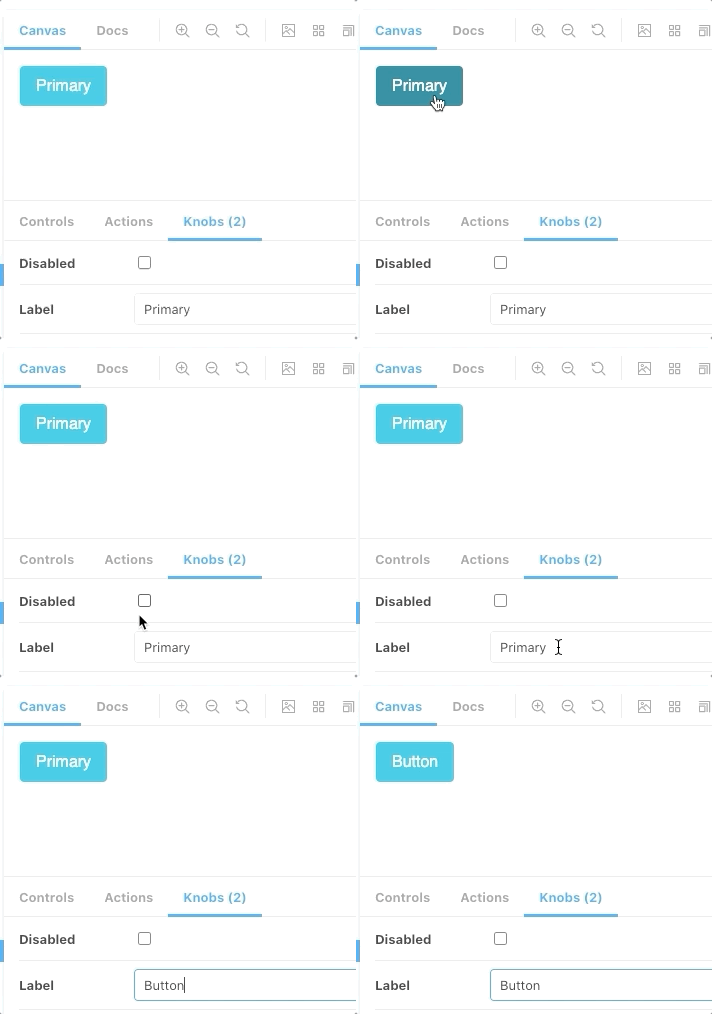
On the component level, we can also generate documentation, that is based on code, maintained in the same repository, and up to date:
import { Meta, Story, Canvas } from '@storybook/addon-docs/blocks';
import { PrimaryButton } from '../buttons/buttons.stories.js';

<Meta title="Style guide/Components/Buttons" />

# Buttons

## Primary

Lorem Ipsum is simply dummy text of the printing and typesetting industry. Lorem Ipsum has been the industry's standard dummy text ever since the 1500s, when an unknown printer took a galley of type and scrambled it to make a type specimen book.

<Canvas>
    <Story inline name="Primary">
        <PrimaryButton />
    </Story>
</Canvas>

It is one thing to try to design UI components to be accessible. It is another thing to actually test them. One of my favorite addons to the storybook is the accessibility addon. It uses the Axe accessibility tools in the background and makes it super easy to ensure accessibility on the different levels of the solution, starting from the components.
If we take our button as an example again we can actually see that I have a problem with it.
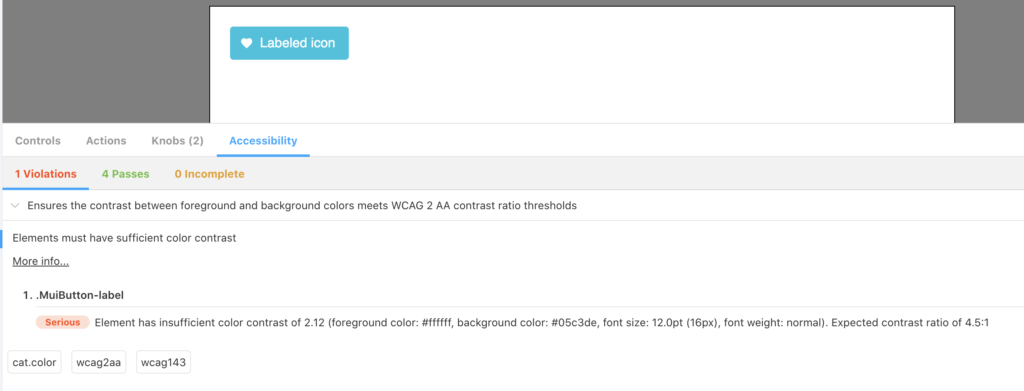
The button caption color, compared to the background does not meet the WCAG 2 AA contrast ratio thresholds. The ratio should be 4.5:1, but it is only 2.12. By changing the primary contrast text value from our token “white” to “black” in the theme we easily clear the problem. The extension also lets us test our components and solution with different color blindness options.
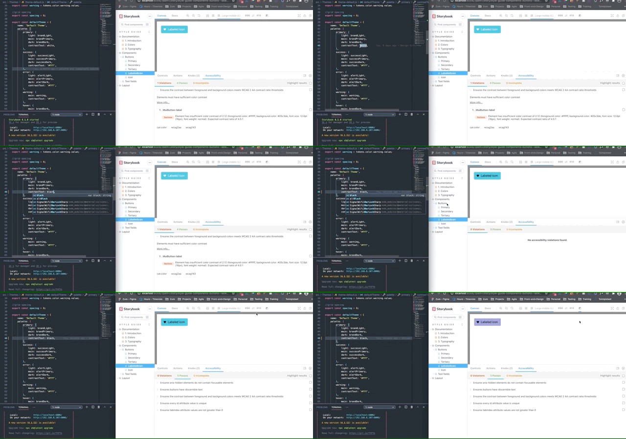
This has only scratched the surface. Storybook makes it possible to add also much richer documentation. We could add prop information, code snippets, styling information, args.
Tokens can be used for much more than just color, typography, or spacing. Any re-usable value, that we use could be a token.
We don’t need to limit our storybook to just components. In the same way, we could build layouts or even full features in isolation, with storybook as our playground.
These tools help to bring design, code, and documentation together. Fast, isolated development and experimentation without the fear of breaking our business logic and with a single source of truth.

Our newsletters contain stuff our crew is interested in: the articles we read, Azure news, Zure job opportunities, and so forth.
Please let us know what kind of content you are most interested about. Thank you!