- Blog
#Zure #Zure Netherlands
Zure expands to Netherlands
- 01/05/2025
Reading time 2 minutes

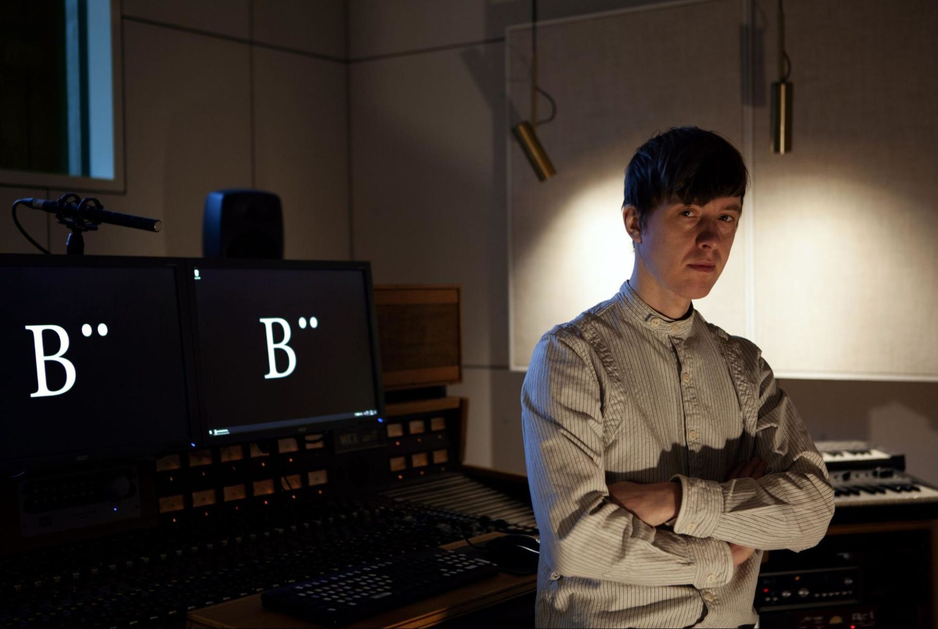
Hi, I’m Jani Lehto from Böhle Studios and this article is about how we created the Zure sound logo and other audio brand elements for Zure. Since the project had both an excellent starting point and great results, this can also be read as a general guideline for audio branding!
The most important ingredient of good audio branding is the knowledge of the brand. It is not enough to see a graphic logo and a script for a single TV ad, or get a few generic keywords like “positive” and “interesting”. Fortunately, Zure had a brand manual in development. Their self-awareness was already far above average, and also well put into written form.
For creating more abstract brand content like sound, these kinds of graphs and texts are extremely useful:
When I had digested the brand manual I crawled the internet for tech & IT sound logos, both today’s current ones and yesteryear’s classics. One of the clearest observations was the dualism: technology is admired but often the human touch and being “approachable” is somehow mixed in. Often this meant having multiple layers of sound, where some elements represented the advanced technological perspective with futuristic electronic sounds and some layers gave the warm human touch with a human voice or perhaps some acoustic-sounding instruments like woodblocks.
In Zure’s brand, there is also a kind of dualism between technological excellence and a warm collective spirit. After some thoughtful discussions with Zure’s Creative Director Joona Puurunen and other key personnel we ended up defining two messages that the sound logo should send:
Roar at challenge – this is also Zure tagline.
Learn & work together – a combination of other core values and practices of Zure.
One interesting aspect of modern sound logos is whether or not a recognisable melody has been a project goal. Many classic sound logos are impossible to hum, sing, whistle, or imitate in any way with human vocal cords. Still, many companies think that they need a three to five note melody that ends on a root note of a major scale (the major scale is “duuriasteikko” in Finnish).
For some major consumer brands, the sung brand slogan melodies may be the number one choice. But for Zure it was clear that we can also achieve recognisability by using extraordinary sounds, and a melody is not required. But we did not want to unnecessarily limit ourselves to 100% sound design only, so all options were kept on the table.
In musical terms, the first tests included some chord progressions, arpeggios, and synthetic sound elements. Some of them were purpose-made, some were old demos and some were samples from more or less known music releases. I presented them to Zure’s team and gained some appropriate, businesslike, and very useful feedback. Then the presentation containing the test clips was dropped into Zure’s internal chat where I did not have access, so the whole Zure crew could comment freely, with no filters on.
The most important single feedback comment came from those chats (I got a pile of screenshots later): “no more any ‘life is wonderful’ tech company sound logos!” That confirmed my hunch that in this case, we might do something that really sounds daring, not just something that has a vague reference of boldness hidden deep down.
After creating a few suggestions for a final sound logo I felt that I was trying too much to “tick all the required boxes”. Often the best approach is not to create music (sounds, music, potayto, potahto) about the brand or the product in question, but about the people behind the brand or about the people who use the product. That way you can put more soul into it and lose the “designed-by-a-committee” feeling.
So I clicked “new empty session” and my last idea ended up being the one. Although it is created without thinking of any brand keywords it definitely has the “roar at challenge”, and in the beginning, there is a spark of knowledge (or maybe rather a flash of invention or an atom splitting). Probably at this point, I had absorbed the Zure brand identity at such a level that it continued affecting me subconsciously… The final sound also has the same synthesis of dark and bright that Zure visual look has, and on my personal sound-logo-graphy it definitely goes into all-time top-3.
In this project, the video was developed at the same time with audio, and that should always be the case. Both sides can inspire each other, and I had a constant dialogue with Zure’s Joona. Even if the video is made first and there is a very concrete plan for its audio track, some flexibility with video timings often creates better results. In this case, a surprising amount of work went into getting all the video & audio elements to fade in and out in a perfectly harmonious way. Here’s a scribble created during a conversation about the differences in video and audio element intensities:
Besides the sound logo, we created video & audio for a web conference intro title and a web conference intermission background “loop”. We didn’t do any elements for “maybe this would have some use someday” reasons, but I always archive the projects in such a way that further versions and remixes are possible in the future.
After spending dozens of hours tweaking similar five-second sound clips a fresh pair of ears is needed, so Tuomas Salmela from Phonogenic audio mastered the final files.
Böhle Studios thanks Zure for a great project, and hopefully all you blog readers enjoy the graphics & sound in their future web conferences and videos!
Our newsletters contain stuff our crew is interested in: the articles we read, Azure news, Zure job opportunities, and so forth.
Please let us know what kind of content you are most interested about. Thank you!