- Blog
#Design #ROI #User research #UX
Invest in UX for a better ROI
- 05/06/2024
Reading time 4 minutes
This post is co-written with UX & Service Designer Natasha Overell and was inspired by our UX Consulting work with Jakamo.
Jakamo has created a comprehensive, B2B digital platform focused on connecting suppliers and their customers across the manufacturing ecosystem. Jakamo’s platform assists over 3,000 companies and thousands of users in handling their demanding work, by giving them the tools and harmonized data needed in order to run their businesses efficiently.
Serving so many users with widely different needs, and complex data requirements whilst maintaining a cohesive, clear, and pleasing user experience requires development team-powered design thinking 🔥.
✔️ 1-2 months timeframe
✔️ 2 of Zure designers and 7 of Jakamo’s development team
✔️ Assess the current platform’s usability and accessibility
✔️ Workshop weekly together to understand, share, and improve usability
✔️ Create common components & patterns as a UX Guideline for the development team
✔️ Consult the team on any questions about user experience and user-interfaces
Jakamo’s platform does a lot and provides more than 13 sub-applications to tackle customer needs. They can concern claims, contracts, shared project assets, offers, orders, and more. Even though there’s a lot of functionality happening and actions can be quite unique to business processes users have, it does not mean the way the application in general behaves and looks should be unique each time. It is important to create and follow guidelines to make sure views and interactions make sense on every page the user visits during their work day. Creating patterns that feel familiar, meaningful, and connected from view to view.
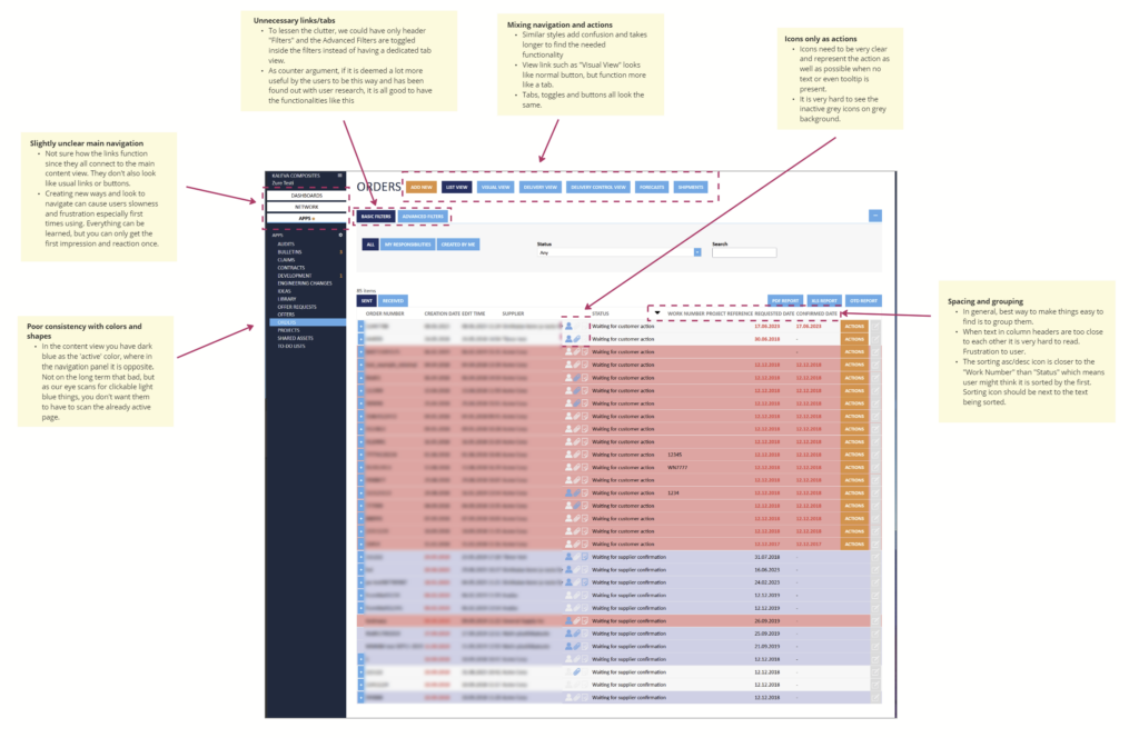
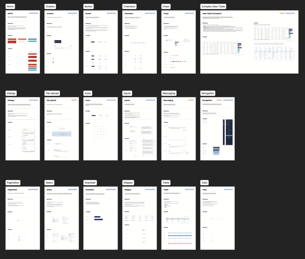
We found that a simple, yet impactful change to the color usage within their platform could drastically improve their users’ overall experience; so we created a set of UI themes and a compact component library. We highlighted the need for clear communication in forms, the simplicity of universal patterns with actions, and step-by-step walked the development team through the use and behavior of each component they need.
All commonly used components were made in Figma based on customized Material UI to align with Jakamo’s brand visuals (colors, typography, etc.). Ensuring that the development team can easily pick the right component for the purpose.
In Jakamo’s case, as is often with other similar ones, the data creep can visit any table as requirements keep pouring in with time, and more information is wanted to be displayed in the same view by multiple groups of people. A common question occurs in the B2B world of applications and tools…
You can’t.
Ok, hear me out.
✔️ You will have to make priority choices with all shown information, interactions, and actions. In Western culture reading from left to right, place the most used information to the left of the table, such as data identifier values or important dates. Give control to the user to personalize the view to the extent that your technical, privacy, and security limitations allow. Let users customize the table content to their needs, and let it be saved to either their account or at least in the browser session.
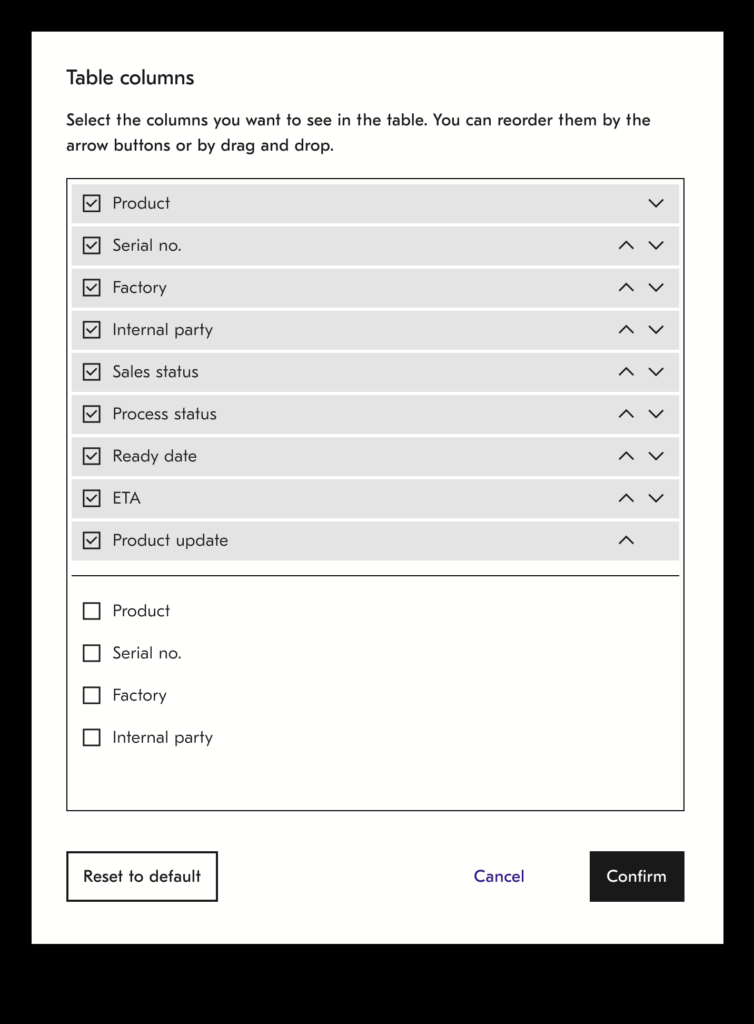
✔️ When there just is not enough horizontal space for all the columns, you need to implement a clear horizontal scrolling and decide which information will by default be hidden. Again, allowing the user to select the order of columns will help with this as you don’t have to choose from thousands of different users in different roles.
✔️ It is important also to not hide any important actions behind the horizontal scrolling. For this, consider using sticky columns so that the rightmost column or two will never be scrolled. You can place actions and other important information there.
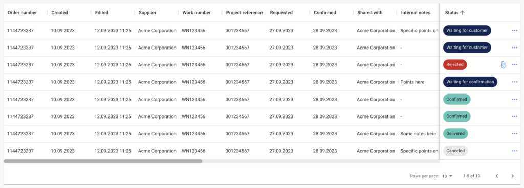
✔️ Use role-specific thinking when choosing the default set of columns and information you show in a table. By default, try to show the necessary information first for the majority of user roles. When users are allowed to customize and save that customized view, the <15% of edge case users can still adjust the table to their liking.
✔️ Utilize both sorting and filters in a smart manner. Sometimes for a user, it might be only needed to see data in a certain chronological order or by a status. This does not require the user to go through a bundle of filters. We can sort by default with that value, let the user also save the sorting option they’ve chosen and the rest of the data in the table are supporting data. Speaking of supportive data…
✔️ By researching your users’ table usage, only show data in a table that is needed and ditch the rest to a details view. Users will be happier to have less cognitive noise from trivial information around their useful ones, even when it requires an extra click.
Very proud of the feedback we received from the Jakamo’s development team! The team was great to work with and showed us enthusiasm for bettering their users’ lives. They clearly care for their customers to have a great experience while serving the data and functions needed. It is a long-term journey to implement and onboard change to complex existing software. As the team has the same idea of the goals and common guidelines for not just implementing visually pleasing tools, but also to actually solve the user or business problem, great quality will follow.

Our newsletters contain stuff our crew is interested in: the articles we read, Azure news, Zure job opportunities, and so forth.
Please let us know what kind of content you are most interested about. Thank you!